

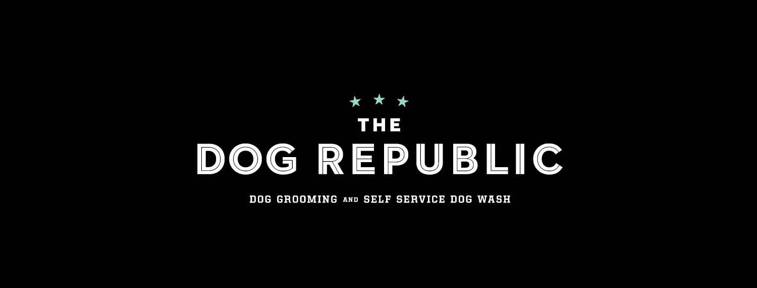
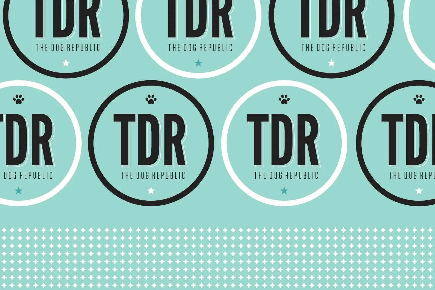
Client: The Dog Republic - a modern and friendly grooming shop and self serve dog wash destination located in Vancouver, B.C.
Role: Art Direction & Design, Brand & Print system
The Creative Brief
The Dog Republic needed a visual identity that felt premium, approachable, and clean. They needed a system that could scale across signage, menus, gift cards, and retail experiences.

1. The Idea
Build a brand that feels like your dog’s favorite barbershop. A blend of rules with inline typography, and playful illustrations. Stars, paws and hearts became the core of a design system.
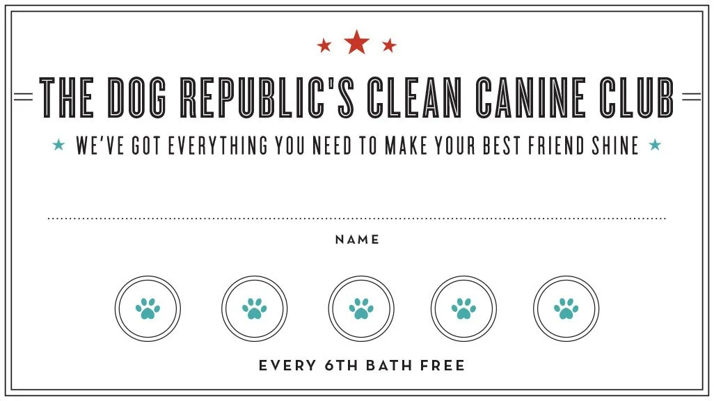

2. Collateral System
From the punch card to the pricing card, each piece uses the same visual DNA.


4. Playful expressions
We love to take photos of our dog(s) so we saw an opportunity for a painted photo op outside on the building. Perfect for social ads!

3. A timeless color system
The teal paired with rich black and a pop of red creates contrast and energy and use classic colors that don’t go out of style.

5. Branded touchpoints
The brand works at every scale: tiny icons feel cohesive next to bold typography.

Dog mats


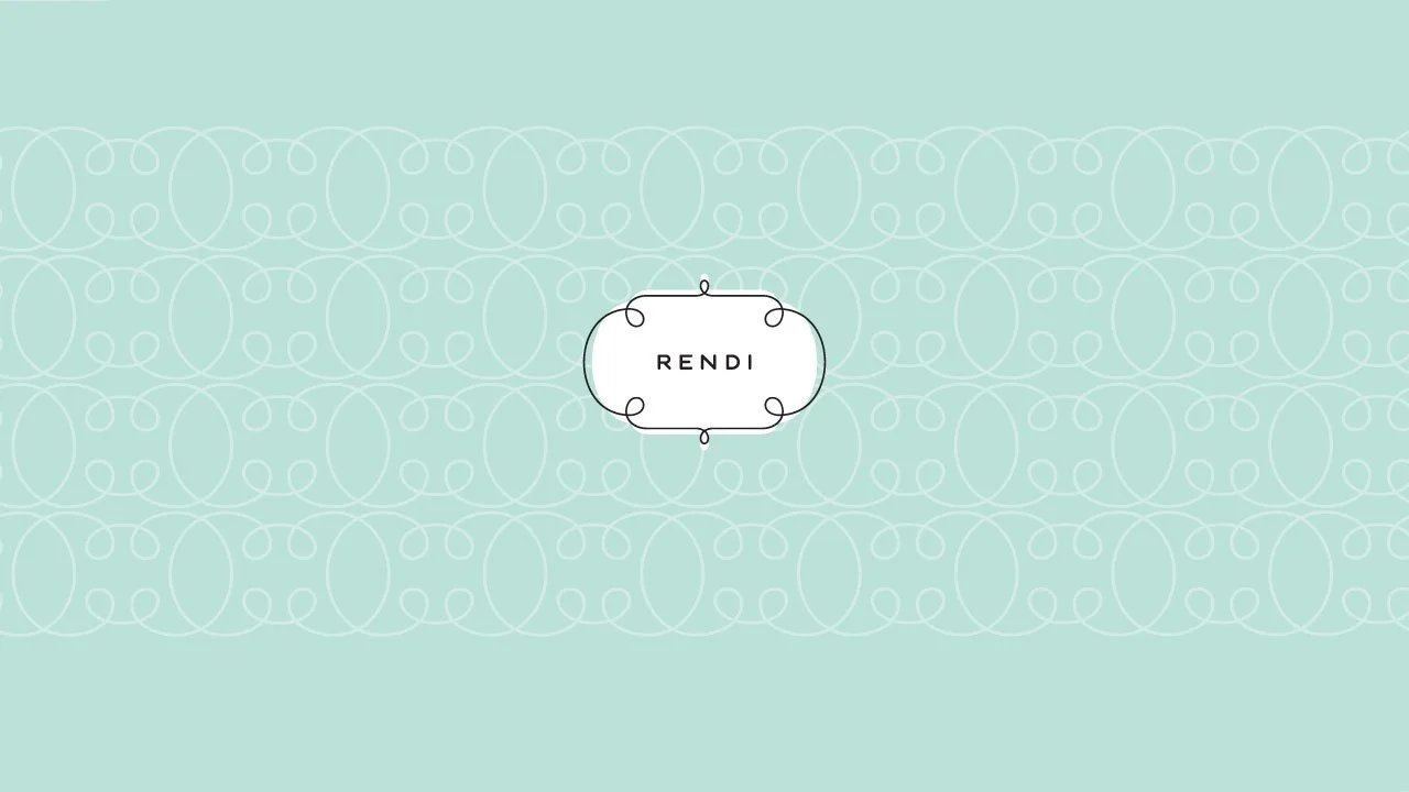
Client: Rendi - a Colorado manufacturing company producing personalized frames and home décor.
Role: Art Direction & Design, Brand & Color system
The Creative Brief
Develop a logo for a women-focused frame + home decor company


1. The Idea
Build a brand that reflects the company’s best-selling product (framed home decor) and that is instantly recognizable.

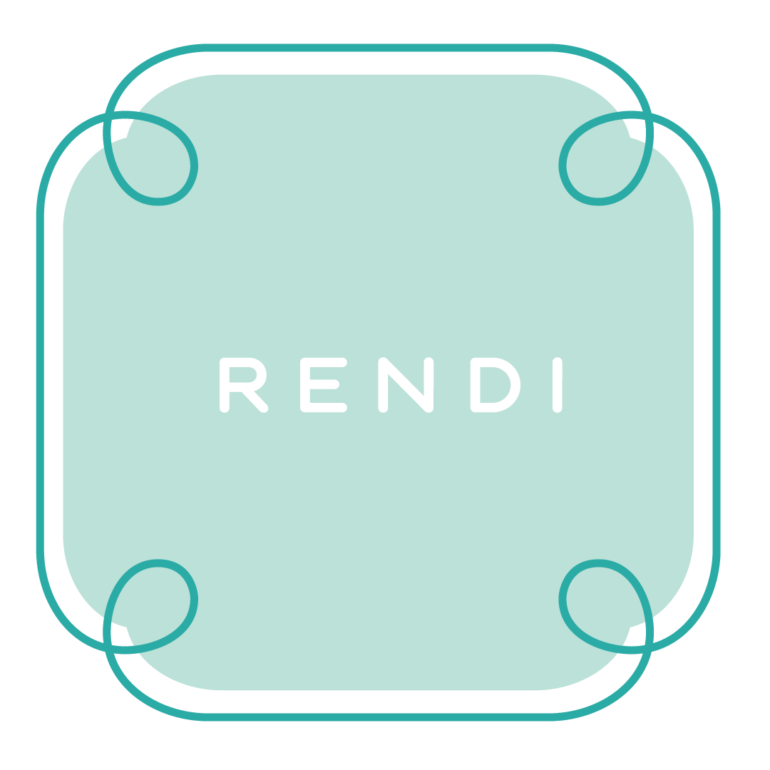

2. Logo system
The multi-shape system and color palette support a wide range of product lines, while the pattern language becomes a recognizable visual asset across packaging and digital.
3. A modern color system
Five colors meant to evoke inspiration, creativity, and warmth.
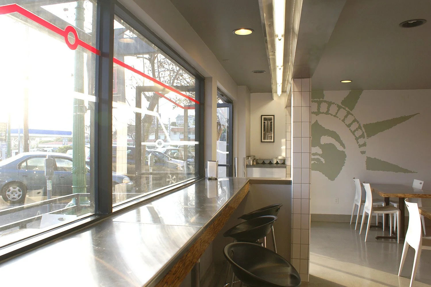
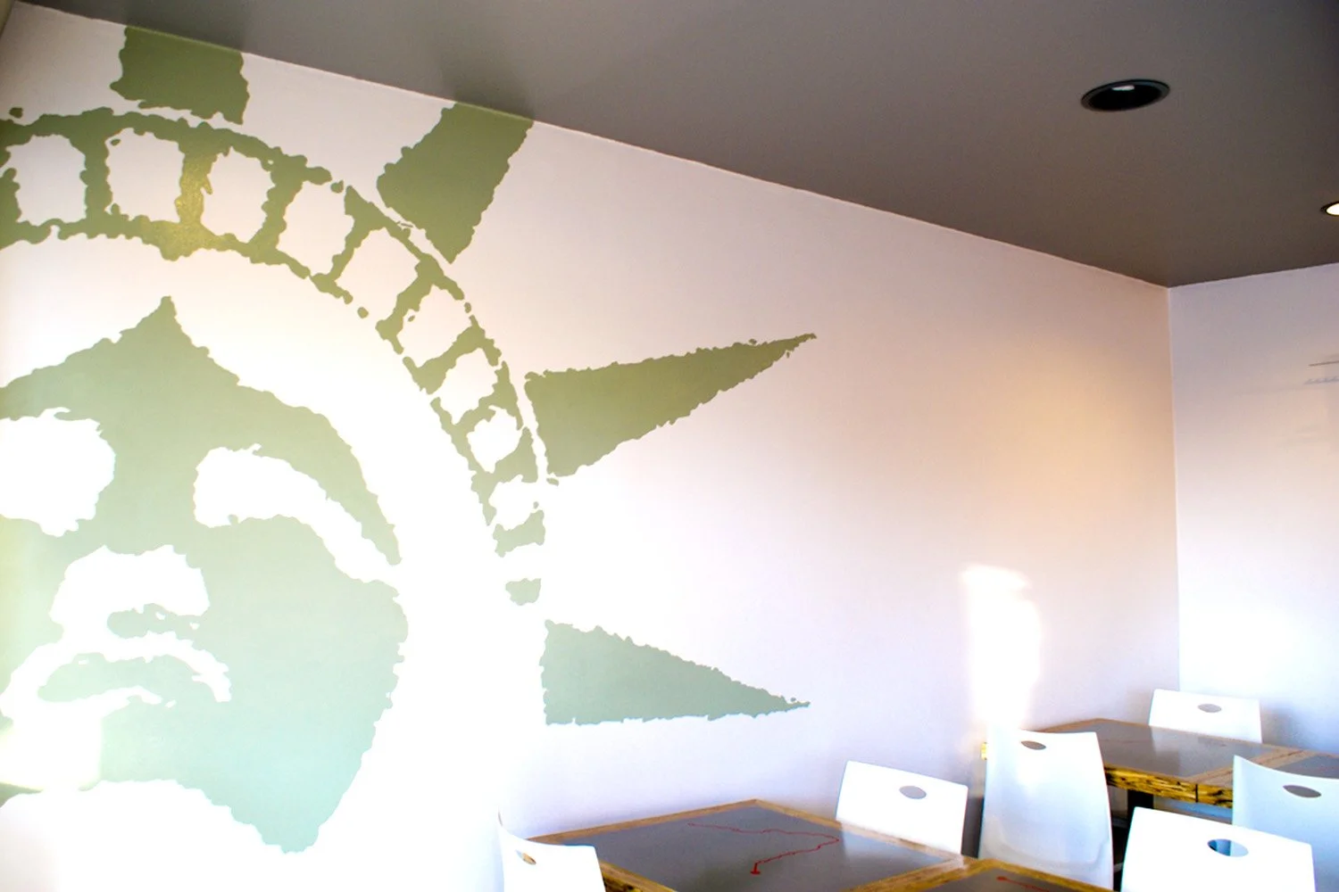
New York Giant Pizza
NYGP, a local chain in San Diego.
I worked with an architect to bring the New York subway system to California through signage and graphics


BRIO Apartments
An upscale development in Walnut Creek, California. The logo is meant to mimic the side of the condo.


logo explorations

brand launch collateral